It is so easy to fall in love with beautiful kitchen photos on Pinterest, only to feel completely stuck when it comes to picking a paint color for your own home. Most of us stare at those tiny paint swatches under terrible hardware store lighting, worrying that a bold color will make the kitchen feel like a dark cave, or that a safe neutral will end up looking sterile and boring. The kitchen is the absolute heart of the home, and if the colors feel off, the whole house can feel a little uncomfortable.
In my experience, the biggest mistake people make is choosing a cabinet color based solely on what is trendy online, without considering how they actually use their space day-to-day. A modern kitchen doesn’t have to look like a cold, futuristic museum. It should feel warm, inviting, and easy to live in, even when there are dirty dishes on the counter and mail piled up on the island. By making small styling changes, pairing the right hardware, and choosing paint tones with warm undertones, you can completely change how your kitchen feels.
In this guide, we are going to walk through 20 modern kitchen cabinet color ideas that are practical, beautiful, and guaranteed to make your space feel more put together without trying too hard.
1. Muted Sage Green Cabinets
What I personally love about this look is how incredibly calm it makes a busy kitchen feel. Muted sage green has soft grey undertones that keep it from looking too bright or grassy, giving your kitchen an earthy, grounded vibe that feels modern but highly approachable. It works beautifully in homes that get a lot of natural light, reflecting the outdoors without feeling overwhelming.
To recreate this look, I always recommend starting with brass or warm bronze hardware to balance the cool tones of the green. Pair these cabinets with simple white oak open shelves and creamy off-white walls to keep the space looking open and airy. A common mistake to avoid is using cold, blue-toned white paint on the walls here, which can make the sage green look muddy instead of fresh.
2. Warm Greige Cabinets
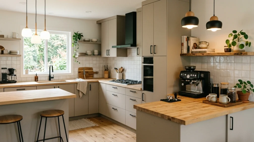
A lot of people overlook this detail, but choosing a true greige instead of a standard grey or beige completely changes the entire kitchen. It is the ultimate compromise because it adapts to the lighting throughout the day, feeling cozy and warm in the evening but clean and bright during the afternoon. It is a fantastic option if you want a neutral kitchen that still has some depth and personality.
I always suggest pairing warm greige cabinets with polished nickel or black hardware for a bit of contrast. If you want to keep things budget-friendly, simple butcher block countertops look stunning next to greige and add a ton of natural warmth. Try to avoid pairing greige with heavy, dark granite countertops, as it can quickly make the space feel dated.
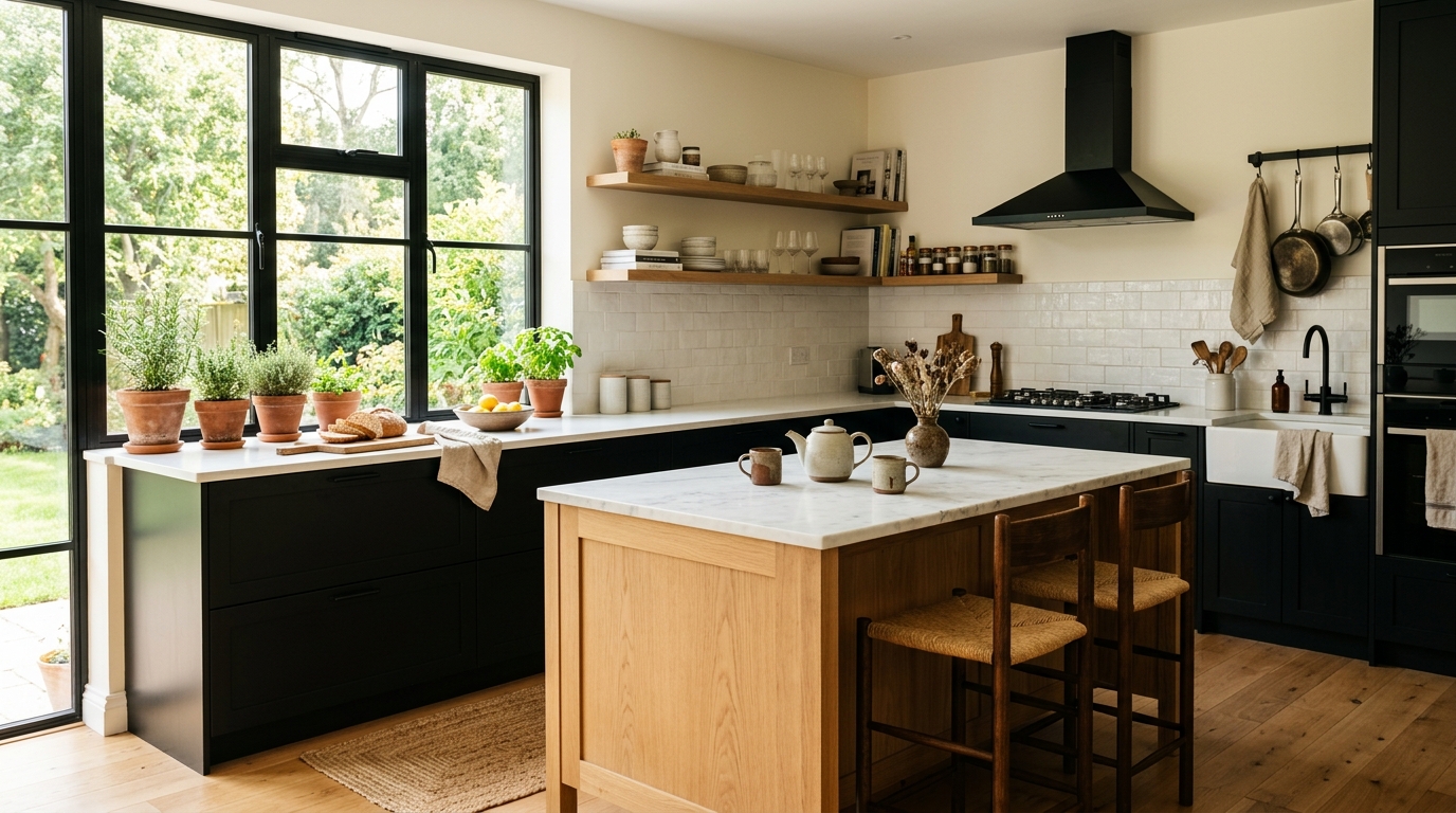
3. Chalky Charcoal Black Cabinets
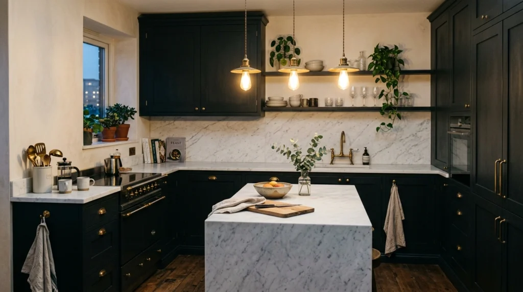
If you want a kitchen that feels incredibly sophisticated but still cozy, a soft, chalky charcoal black is a beautiful option. Unlike a stark, glossy black, a matte charcoal has dusty grey undertones that soften the look and make it feel much more lived-in and comfortable. This works especially well if you want to look more put together without trying too hard, particularly in smaller kitchens where you want to create depth.
When styling charcoal cabinets, use bright white quartz countertops and a light backsplash to keep the room from feeling too dark. I love using matte black hardware on matte black cabinets for a modern, textured look, or classic unlacquered brass if you want a little bit of shine. The biggest mistake here is choosing a high-gloss finish, which shows every single fingerprint and water smudge.
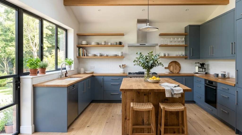
4. Dusty Navy Blue Cabinets
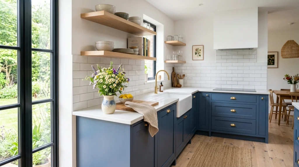
Dusty navy blue is a classic choice that feels distinctly modern when you choose a shade with heavy grey or slate undertones. It brings a sense of quiet confidence to the kitchen without feeling as stark or harsh as a true dark blue. It is a gorgeous color for a kitchen island or a full set of lower cabinets paired with lighter uppers.
To make this look work, pair the dusty navy with warm wood tones, like a white oak vent hood or wooden bar stools. I recommend choosing a simple white subway tile backsplash with matching white grout to keep the focus on the beautiful blue cabinetry. Avoid using cold chrome hardware here; instead, opt for warm brushed gold or antique brass to bring out the warmth in the blue.
5. Soft Cream Cabinets
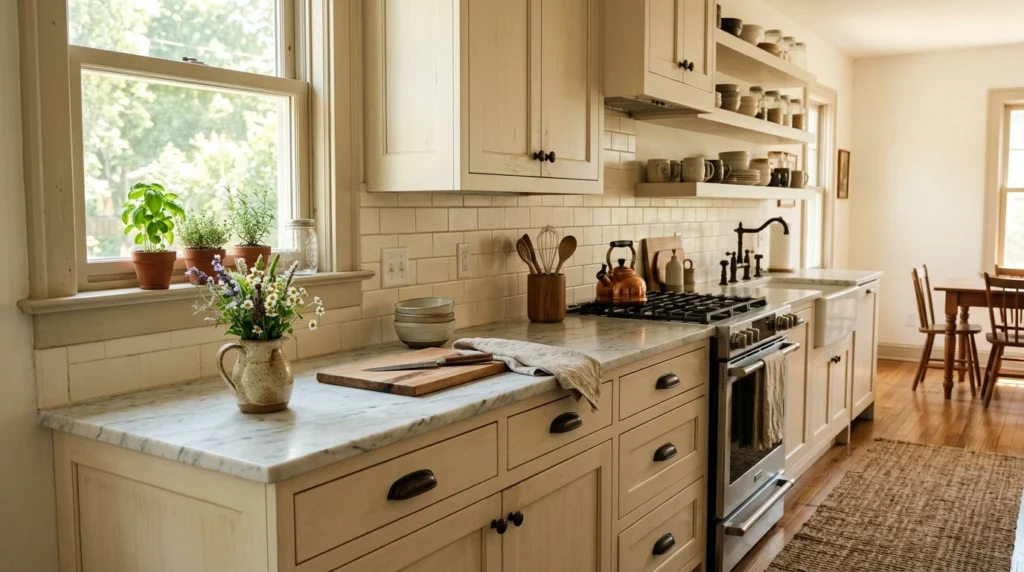
If you are tired of the sterile, stark white kitchens that dominated the last decade, soft cream is the perfect alternative. It gives you all the bright, clean benefits of a white kitchen but feels infinitely warmer, cozier, and more welcoming. It makes the kitchen feel like a place where people actually want to hang out and drink coffee.
In my experience, the key to making cream cabinets look modern is to avoid matching them with yellow-toned countertops. Instead, pair them with a clean white countertop that has subtle grey or gold veining. For hardware, oil-rubbed bronze or matte black provides a beautiful, grounded contrast that keeps the cream from looking washed out.
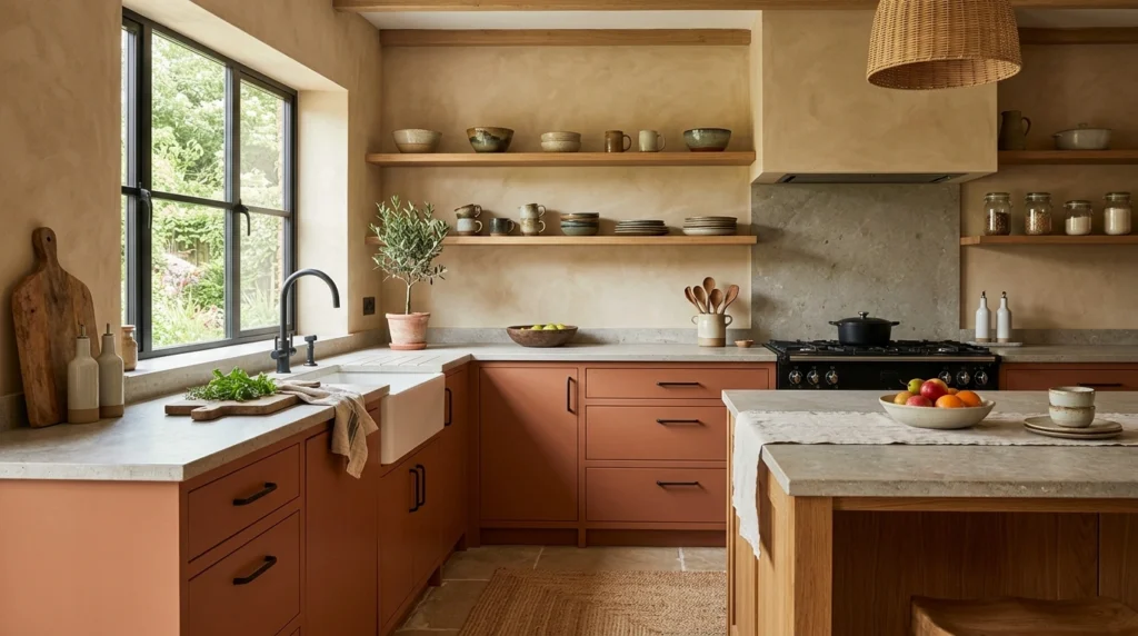
6. Earthy Terracotta Cabinets
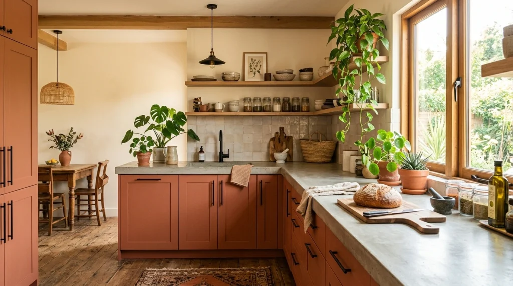
For those who love warm, sun-drenched spaces, earthy terracotta is an incredibly beautiful and unexpected cabinet color. It feels grounded, artistic, and deeply inviting, bringing a touch of Mediterranean warmth right into the heart of your home. It works wonderfully in kitchens with plenty of natural wood accents and plants.
To style terracotta cabinets without looking chaotic, keep the rest of the kitchen simple with creamy plaster-look walls and natural stone countertops. I love pairing this color with simple leather cabinet pulls or minimalist black hardware. A common mistake is adding too many other bright colors nearby; let the terracotta be the main star and keep everything else neutral.
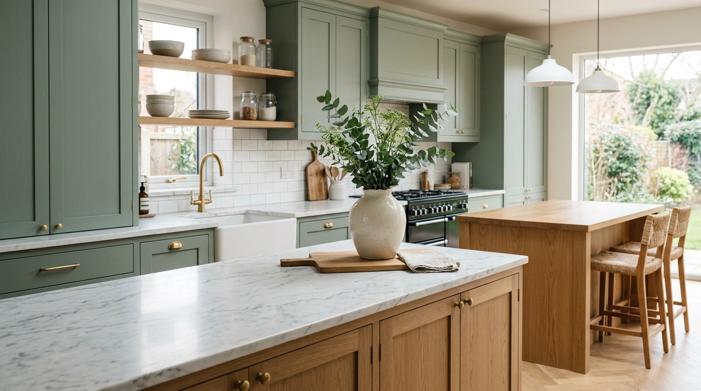
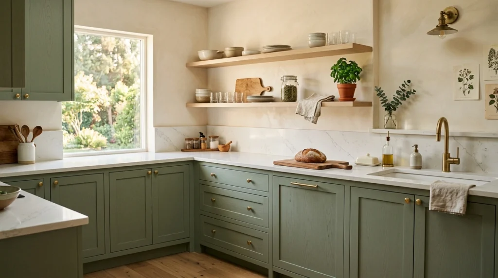
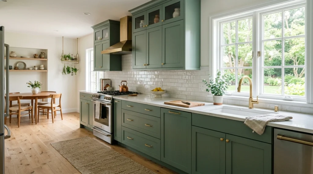
7. Pale Olive Green Cabinets
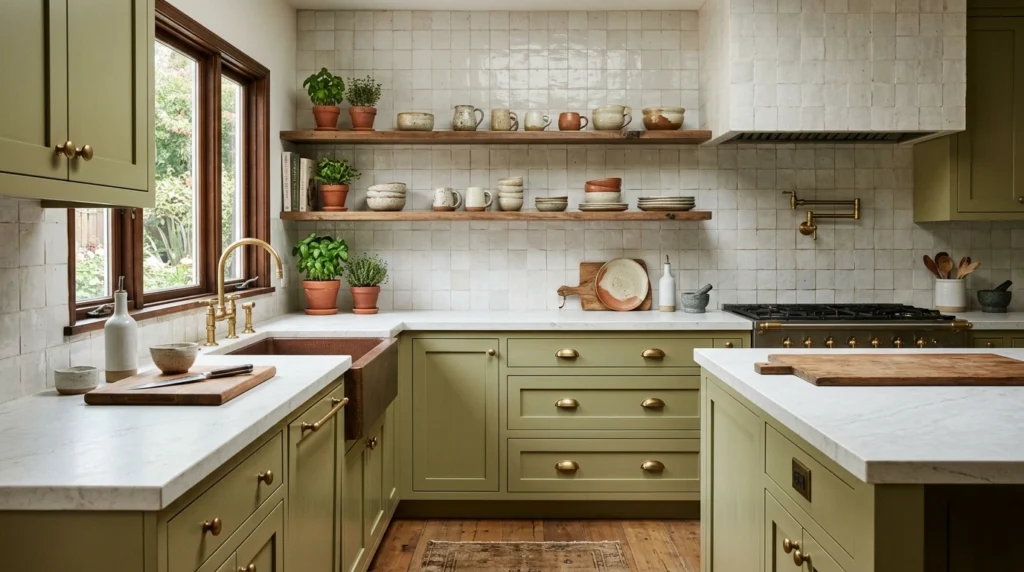
Pale olive is a rich, savory green that feels highly sophisticated yet completely tied to nature. It is slightly warmer and deeper than sage green, making it feel cozy and historic while still feeling modern. It is an amazing choice if you want a kitchen that feels unique but won’t go out of style in a couple of years.
I always recommend starting with unlacquered brass hardware, which will tarnish beautifully over time and complement the organic feel of the olive green. Pair these cabinets with warm zellige backsplash tiles that have slight color variations to catch the light. Keep the countertops light, such as a honed marble or a light grey soapstone, to keep the space balanced.
8. Soft Pigeon Gray Cabinets
Soft pigeon gray is a beautiful, moody color that sits right between grey, blue, and green. It changes color depending on the time of day, making it an incredibly interesting and dynamic choice for a kitchen. It feels soft, heritage-inspired, and very peaceful to look at.
What I personally love about this look is how beautiful it looks paired with classic marble countertops and simple white walls. To keep it feeling modern, use clean-lined, minimalist hardware in a matte black or satin nickel finish. Avoid using warm brass with this specific color, as the cool undertones of the pigeon gray can sometimes clash with very yellow golds.
9. Warm Taupe Cabinets
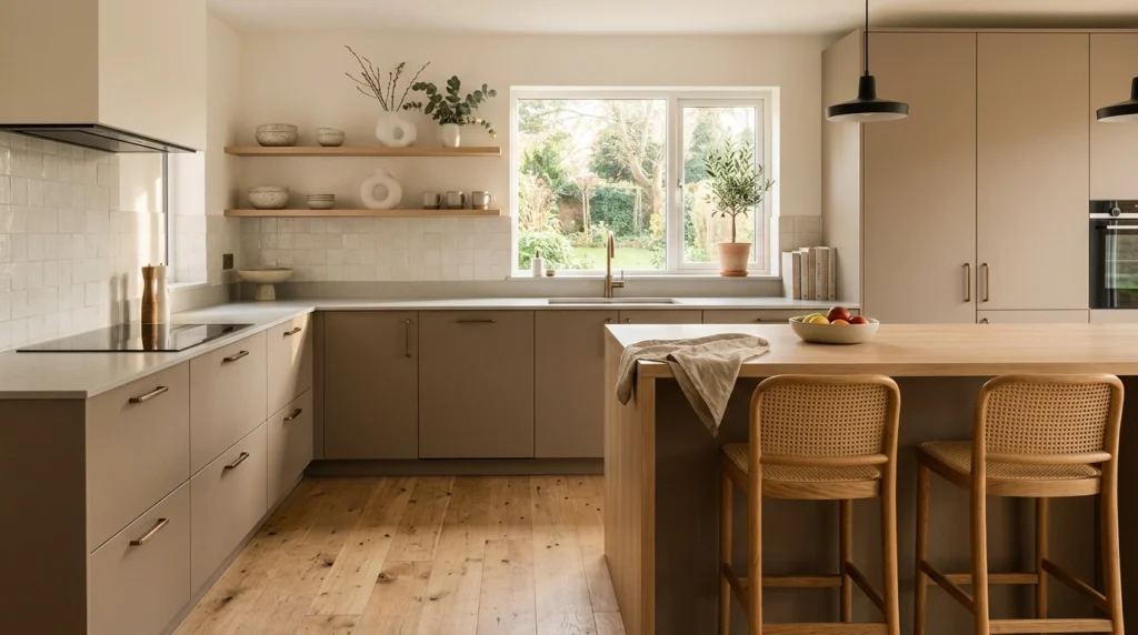
Warm taupe is a rich, earthy neutral that lies somewhere between brown and grey. It feels incredibly grounding and brings an organic, high-end feel to the kitchen without feeling cold or clinical. It is the perfect backdrop for anyone who loves minimalist design but still wants their home to feel cozy.
Pair warm taupe cabinets with natural wood elements, like a raw oak dining table or woven rattan pendant lights. For hardware, brass or brushed bronze looks incredibly beautiful and rich against the taupe background. The biggest mistake people make here is choosing a taupe that is too purple-toned; look for swatches with green or yellow undertones instead.
10. Deep Forest Green Cabinets
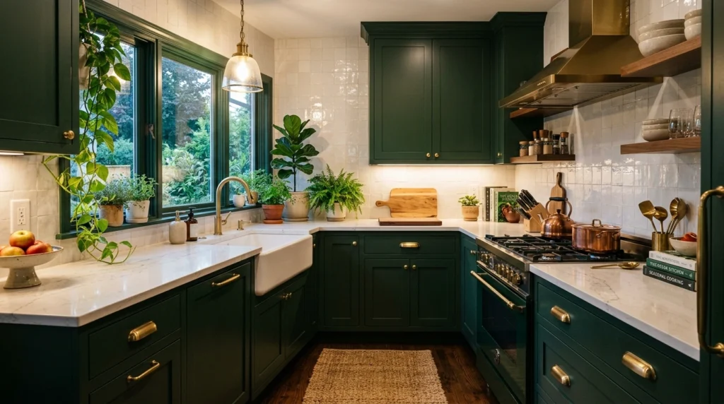
Deep forest green is a bold, dramatic choice that feels incredibly cozy and rich, especially in the winter months. It acts almost like a neutral, bringing a sense of quiet luxury and depth to the kitchen without feeling loud or overwhelming. It is perfect for creating a cozy, cabin-like feel in a modern way.
To recreate this look, pair forest green with bright, reflective surfaces like polished brass hardware and a white glazed tile backsplash to bounce light around the room. I highly recommend using open shelving for some of the upper cabinets to prevent the kitchen from feeling too heavy or closed-in. Avoid pairing this color with dark wood floors; light oak or light tile floors work much better.
11. Butter Yellow Cabinets
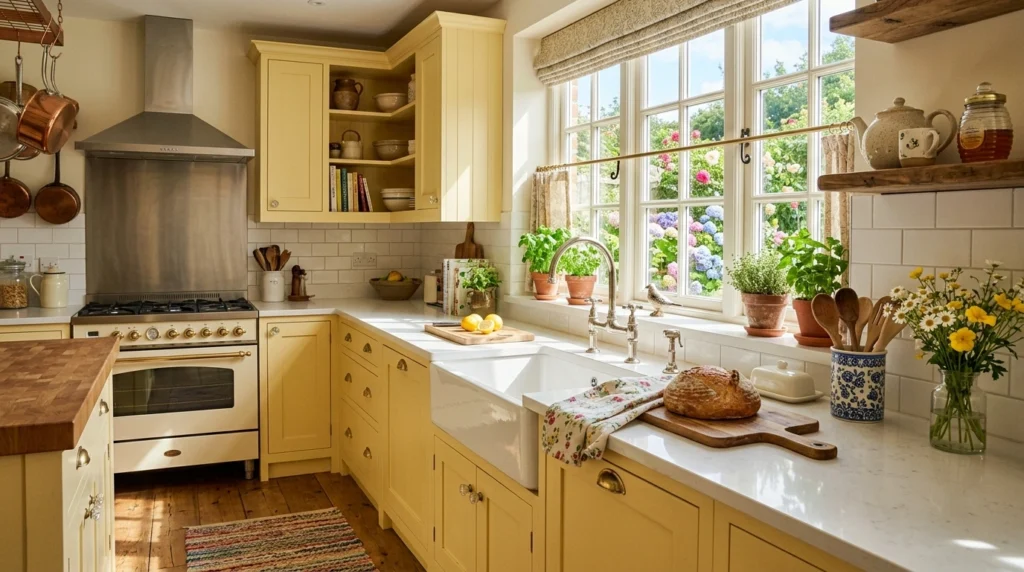
Butter yellow is making a massive comeback for anyone who wants a kitchen that feels cheerful, bright, and historic. It is a very soft, pale yellow with warm cream undertones, making it feel sunny and happy without looking neon or childish. It works beautifully in cottage-style or eclectic modern kitchens.
To style butter yellow cabinets, pair them with simple white marble countertops and classic bridge-style faucets in polished nickel. For hardware, delicate glass knobs or simple brass pulls keep the look feeling light and vintage-inspired. Avoid pairing this yellow with heavy black accents, as it can look a bit too harsh and graphic.
12. Barely-There Soft Pink Cabinets
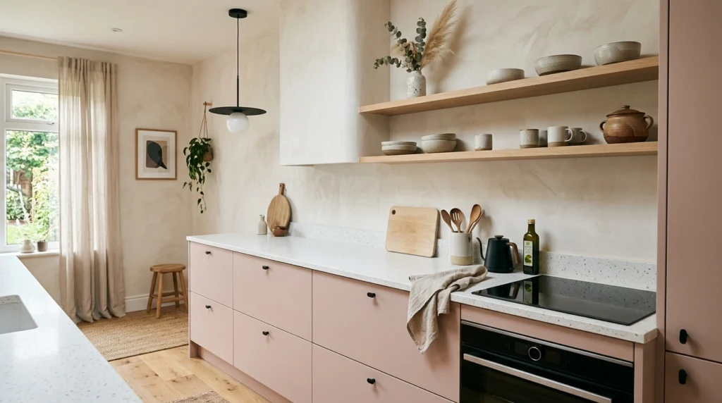
Soft, plaster-like pink is a gorgeous, sophisticated neutral that is far more versatile than most people think. It acts almost like a warm cream, but with a subtle rosy undertone that makes everyone in the room look healthy and glowing. It feels modern, artistic, and incredibly peaceful.
I always recommend starting with matte black or dark bronze hardware to ground the soft pink and keep it from looking like a nursery. Pair these cabinets with light oak wood accents and simple, modern light fixtures. The biggest mistake here is choosing a pink that is too bright or blue-toned; you want a dusty, greyed-out pink that looks like natural plaster.
13. Rich Espresso Brown Cabinets
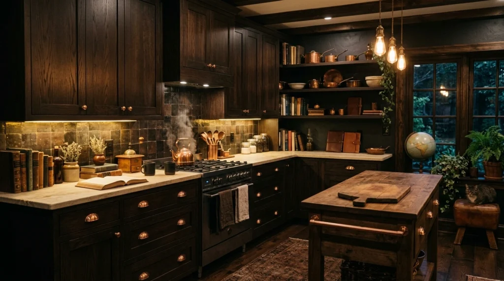
Rich espresso brown is a gorgeous way to embrace the dark academia aesthetic in a kitchen. It is a deep, chocolatey brown that feels much warmer and softer than black, bringing a massive amount of depth and comfort to the space. It looks incredibly luxurious when done in a matte or satin finish.
What I personally love about this look is how beautiful it looks when paired with rich cream countertops and plenty of indoor plants. Use brass or copper hardware to bring out the warm, red undertones of the espresso paint. Avoid using cold grey walls with this look, as it will make the brown look dull and dated.
14. Slate Blue-Gray Cabinets
Slate blue-gray is a cool, calming color that feels incredibly clean and fresh. It is a fantastic option if you want to add color to your kitchen but still want it to feel neutral enough to match the rest of your home. It has an architectural, modern feel that looks great in both modern apartments and historic homes.
To make slate blue feel cozy, pair it with warm wood countertops or a warm-toned wooden island. Use brushed chrome or stainless steel hardware for a sleek, monochromatic look, or antique brass if you want to add a touch of warmth. Avoid using very cool, blue-white lighting in this kitchen, as it can make the slate blue feel clinical.
15. Warm Sand Cabinets
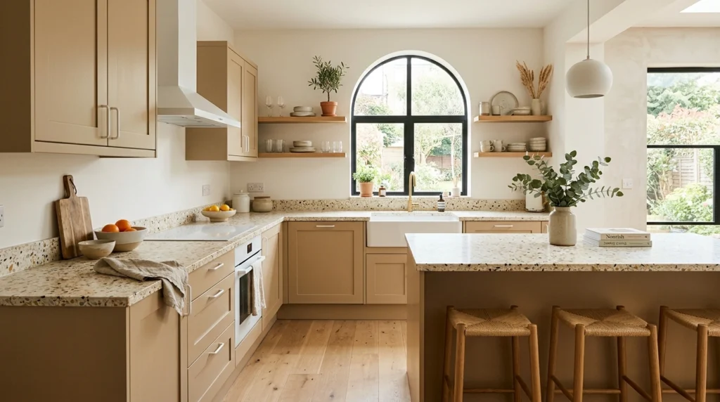
Warm sand is a beautiful, pale neutral that is slightly lighter than taupe and warmer than beige. It feels like a sunny day at the beach, bringing a light, airy, and organic feel to the kitchen. It is a wonderful choice if you want a neutral kitchen that feels incredibly bright but still has a lot of character.
Pair warm sand cabinets with terrazzo countertops or countertops with a lot of organic texture. I love using matte white hardware on sand-colored cabinets for a really clean, modern, layered look. Avoid using heavy, shiny chrome hardware here, as it can distract from the beautiful, soft simplicity of the sandy color.
16. Pale Mint Green Cabinets
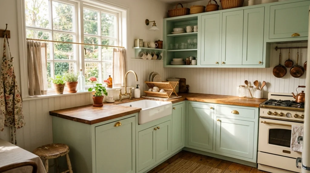
Pale mint is a dusty, pale green with grey undertones that feels incredibly fresh, clean, and vintage-inspired all at once. It is a highly cheerful color that makes the kitchen feel bright and airy, even on cloudy days. It is especially beautiful in smaller kitchens where you want to maximize the feeling of space.
To recreate this look, pair pale mint with crisp white countertops and simple beadboard backsplash details. For hardware, polished brass or classic nickel looks beautiful and keeps the look feeling bright and clean. The biggest mistake is choosing a mint that is too blue or vibrant; look for a shade that looks almost grey on the paint strip.
17. Deep Plum Cabinets
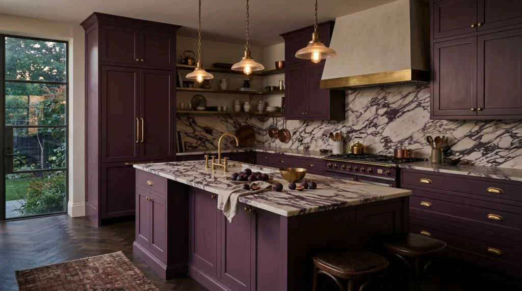
Deep plum or aubergine is a stunning, sophisticated choice for anyone who wants a kitchen that feels bold, moody, and highly unique. It is a rich, dark purple with heavy brown and grey undertones, making it feel incredibly cozy and expensive. It is a gorgeous color for a bar area, a kitchen island, or a dramatic butler’s pantry.
To style deep plum cabinets, pair them with dramatic marble countertops with heavy grey and purple veining. Use unlacquered brass hardware, which looks stunning against the deep purple background. Keep the walls a warm, soft white to ensure the kitchen still feels bright and balanced.
18. Warm Clay Cabinets
Warm clay is a beautiful blend of terracotta, peach, and beige. It feels organic, earthy, and highly modern, bringing a beautiful plaster-like warmth to the kitchen. It is a fantastic alternative to standard brown or beige, offering a bit more color while staying incredibly easy to live with.
Pair warm clay cabinets with simple concrete countertops or light grey limestone. I always suggest using minimal, modern black hardware to give the organic color a clean, modern edge. Avoid using yellow-toned lighting here, as it can make the clay color look a bit too orange.
19. Oatmeal Cabinets
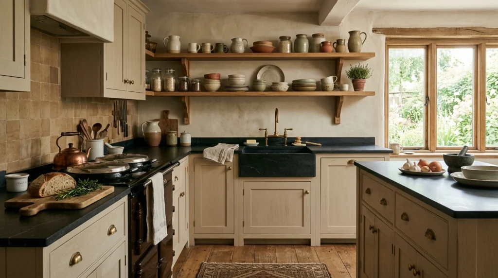
Oatmeal is a beautiful, textured neutral that has tiny flecks of grey, brown, and cream within its undertones. It feels incredibly cozy, clean, and textured, almost like a favorite linen shirt. It is a fantastic choice if you want a bright kitchen that feels completely different from a standard white kitchen.
To make oatmeal cabinets look their best, pair them with natural soapstone countertops and brass hardware. I love using open wooden shelves filled with ceramic mugs and bowls to emphasize the cozy, handmade feel of the space. Avoid pairing oatmeal with stark black countertops, which can look a little too harsh.
20. Eucalyptus Green Cabinets
Eucalyptus green is a beautiful, mid-tone green with strong silver and blue undertones. It feels cool, clean, and highly sophisticated, bringing a breath of fresh air into the kitchen. It is a stunning color that looks incredibly beautiful during the morning hours when the light is soft.
To style eucalyptus green, pair it with white quartz countertops and simple, clean-lined brass hardware. Use a white tile backsplash with a handmade, glossy texture to help reflect light around the room. Avoid using dark, heavy wood accents with this color, as it can weigh down the fresh, airy feel of the eucalyptus green.
Conclusion
Choosing a kitchen cabinet color doesn’t have to be an overwhelming process. At the end of the day, a great kitchen isn’t about having a picture-perfect space that looks like a magazine catalog—it is about creating a place where you feel comfortable cooking, talking, and sharing meals with the people you love. You don’t need to spend thousands of dollars on high-end designer paints to make your kitchen look incredible.
In my experience, simply starting with one or two of these kitchen cabinet color ideas, buying a few sample pots, and painting them on large pieces of cardboard to see how they look in your actual room is the best way to start.
Which of these outfit ideas—or rather, cabinet color ideas—would you actually want in your own home first? I’d genuinely love to know in the comments below!
Frequently Asked Questions
How do I make basic cabinet colors look more expensive?
In my experience, the easiest way to make simple cabinet colors look expensive is to upgrade your hardware to solid brass or matte black, and paint your walls a warm, creamy off-white instead of a stark, blue-toned white.
What paint finish is best for modern kitchen cabinets?
I always recommend a satin or semi-gloss finish for kitchen cabinets. A satin finish gives you a beautiful, modern look that isn’t too shiny, but is still incredibly easy to wipe clean when food inevitably splatters on it.
How can I update my cabinets on a budget?
Painting your existing cabinet boxes and replacing just the doors is a highly affordable way to get a modern look. You can also simply swap out old, dated hardware for clean, modern pulls to completely change the look of the room.
What colors make a small kitchen look bigger?
Light, warm neutrals like warm sand, oatmeal, soft cream, and pale mint green are incredible for making small kitchens feel open, bright, and spacious without feeling cold or sterile.
Do modern kitchen cabinets always have to be white?
Absolutely not! Modern design has shifted heavily toward earthy, organic tones like muted sage green, warm taupe, clay, and even chalky charcoal black to make homes feel warmer and more inviting.