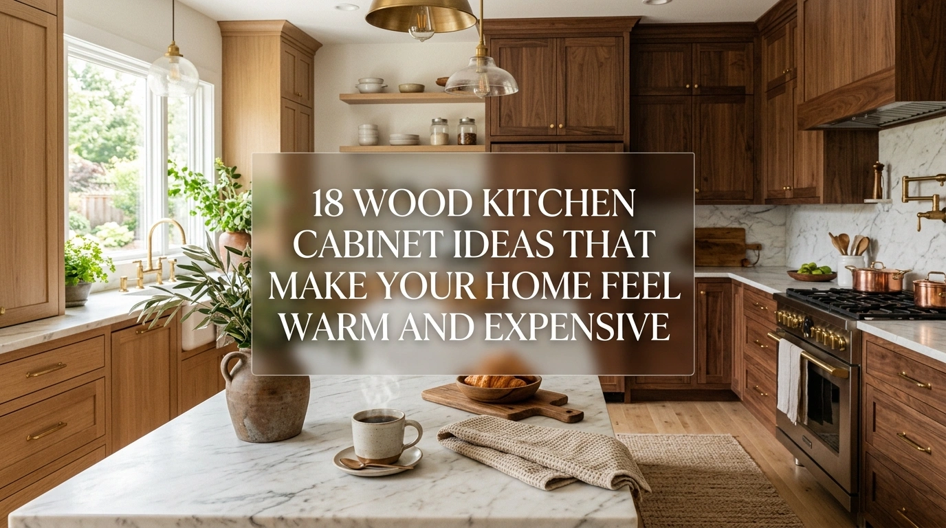
If you are standing in your kitchen right now staring at paint swatches, you know how paralyzing this decision can be. You want a kitchen that feels warm and inviting, but you are also terrified of picking a single color and growing completely tired of it in two years. Going with an entirely white kitchen can sometimes feel sterile and cold, like a doctor’s office. On the flip side, committing to a dark, moody color for every single cabinet can make your space feel small, heavy, and a bit like cooking inside a cave.
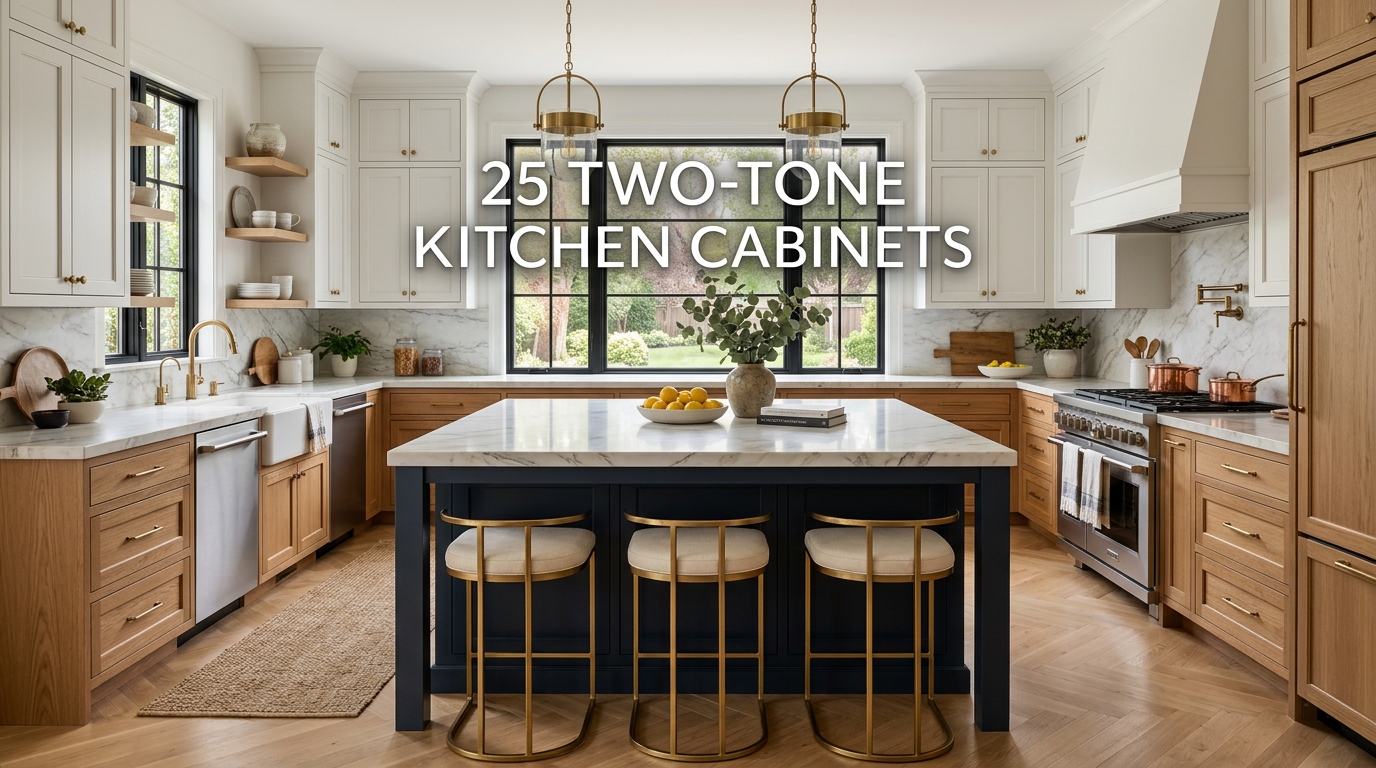
This is exactly why two-tone kitchen cabinets have become such a massive trend on Pinterest and in modern home renovations. By splitting your colors—usually putting a darker, heavier shade on the bottom and a lighter, airier tone on top—you get the best of both worlds. You get the depth and personality of a bold color without sacrificing the bright, open feeling that makes a kitchen nice to spend time in. In this guide, I am going to share 25 practical, beautiful two-tone kitchen cabinet ideas that balance modern trends with classic styling. You will learn exactly why these combinations work, how to style them, and how to avoid the common mistakes that can make a two-tone kitchen look chaotic instead of cohesive.
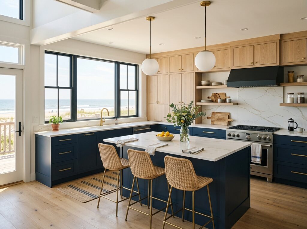
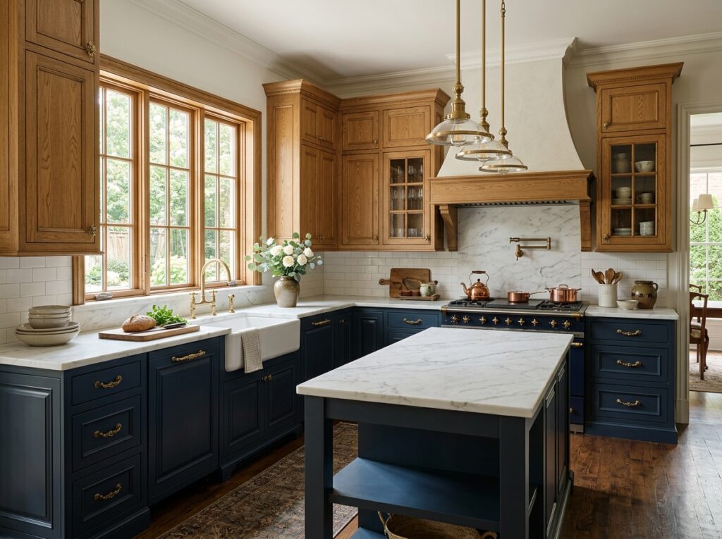
1. Classic Navy and Crisp Chalk White
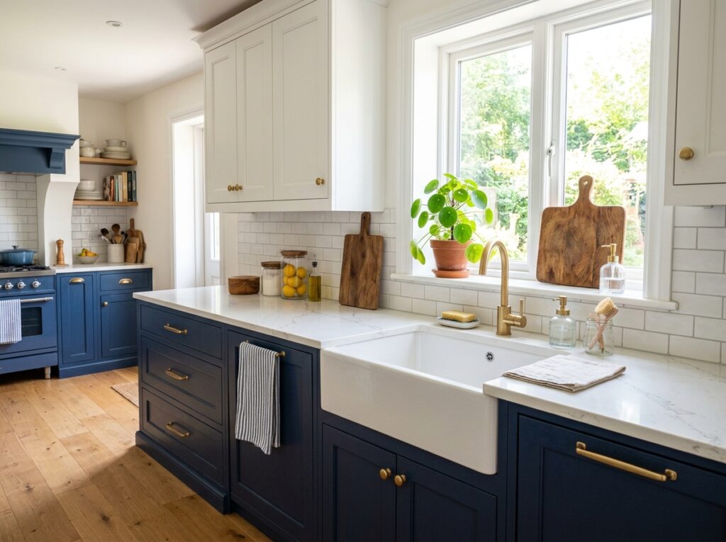
What I personally love about this look is how incredibly grounded it makes a kitchen feel. The deep, rich navy on the lower cabinets acts like a heavy anchor, while the clean, chalky white uppers keep the ceiling feeling high and airy. It is a perfect combination for spaces that get plenty of natural afternoon light, as the blue tones change beautifully throughout the day. It evokes a clean, slightly coastal energy without feeling like you are trying too hard to live near the beach.
To make this look work, I always recommend starting with a matte or satin finish rather than a high gloss, which can make navy look a bit cheap under bright overhead lights. Pair these cabinets with warm brass or brushed gold hardware to cut through the cool undertones of the paint. A white quartz countertop with very subtle gray veining ties the upper and lower halves together nicely. Avoid using dark countertops here, as they will make the lower section of your kitchen look far too heavy and dark.
- Suggested Price Range: Mid to High-End (due to the popularity of custom navy finishes)
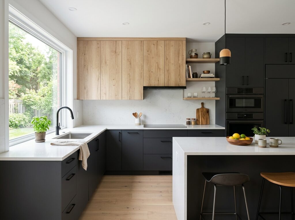
2. Matte Black and Warm Natural Oak
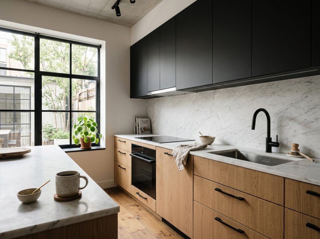
This combination is a dream if you want a kitchen that feels clean and modern but still has a ton of organic warmth. The lower cabinets feature a rich, textured natural white oak with a clear matte sealer, while the upper cabinets (or a surrounding wall of pantry doors) are painted in a soft, flat matte black. It creates a stunning visual balance where the wood grain of the oak softens the starkness of the black, preventing the kitchen from feeling cold or uninviting.
In my experience, the biggest mistake people make here is choosing an oak with too many yellow or orange undertones, which can look dated next to black. Look for a rift-sawn white oak with a cool, sandy finish. Matte black hardware looks incredible on the wood cabinets, while simple brass pulls can add a nice touch of warmth to the black sections. Pair this with a simple white tile backsplash to keep the center of the kitchen bright and easy to clean.
- Suggested Price Range: High-End (rift-sawn oak can carry a premium price tag)
3. Muddy Sage Green and Soft Warm Cream
If you want your kitchen to feel like a cozy, calm sanctuary, this is the palette to use. Sage green is incredibly popular right now, but using a “muddy” version with gray undertones keeps it from looking like a children’s playroom. Putting this soft, earthy green on the lowers and a warm, buttery cream on the uppers creates a gentle, cottage-inspired look that feels incredibly welcoming on rainy mornings.
When styling this, stay away from cold, stark white paints for your uppers; a gentle cream or warm off-white will feel much more natural alongside the sage. I love pairing this look with unlacquered brass hardware, which will tarnish over time and add to the organic, lived-in feel. For countertops, a warm butcher block on an island or a soapstone perimeter works beautifully.
- Suggested Price Range: Budget to Mid-Range (very easy to recreate with standard DIY cabinet paint kits)
4. Charcoal Gray and Textured Walnut
This look is all about rich textures and a slightly more masculine, high-end feel. The upper cabinets are a deep, charcoal gray with soft blue-black undertones, while the lower cabinets showcase the rich, swirling grain of natural walnut. It is a stunning option for open-concept homes where the kitchen is fully visible from the living room, as it looks more like high-end furniture than standard utility cabinetry.
To keep this from feeling too dark, you need to be intentional with your lighting and backsplash. I highly recommend using a bright, reflective backsplash—like a glazed zellige tile—that can bounce light around the room. For hardware, sleek matte black finger pulls keep the lines looking clean and modern. Avoid bulky, traditional handles that might distract from the natural beauty of the walnut wood grain.
- Suggested Price Range: High-End (walnut is one of the more expensive wood species for cabinetry)
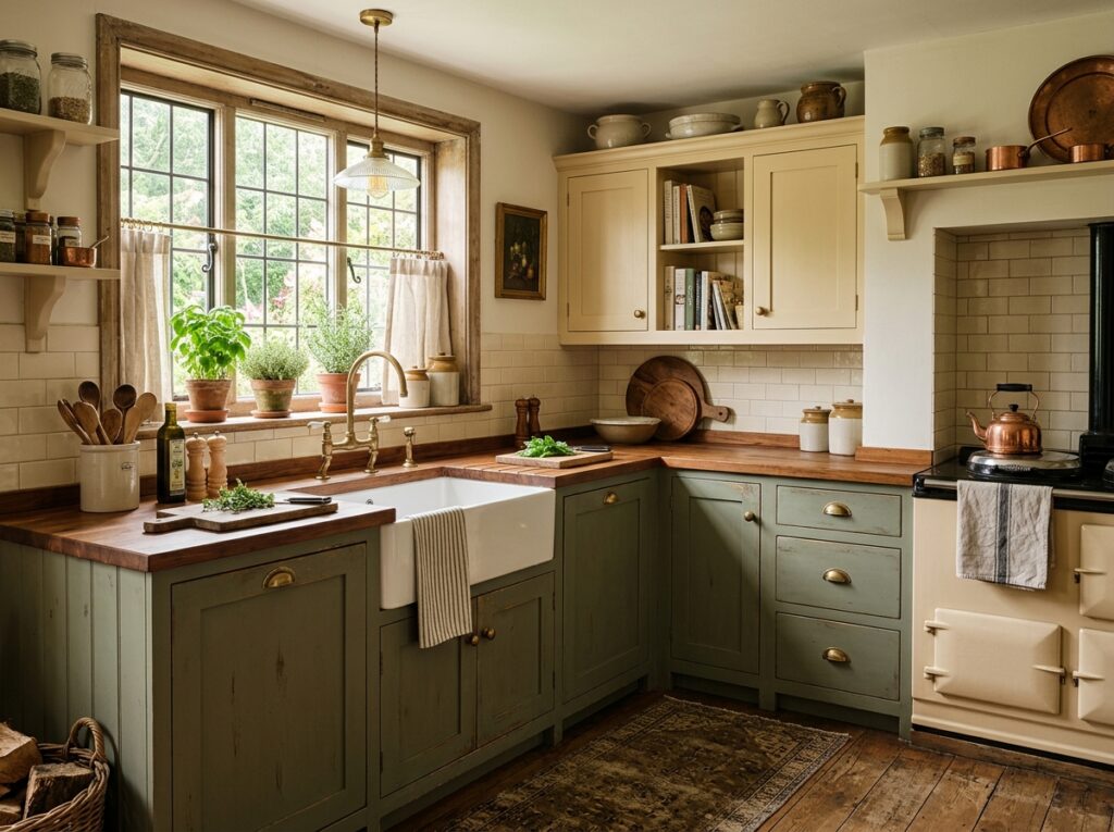
5. Muted Olive and Chalky Off-White
This colorway is for those who appreciate a historic, historic-home aesthetic but still want a clean, updated space. The lower cabinets are a deep, savory olive green, while the uppers are a chalky, historical off-white. It feels deeply rooted in traditional English kitchen design, giving the space an instant sense of permanence and comfort.
A lot of people overlook this detail, but the finish of the paint is crucial here. An eggshell or satin finish works best to let the rich tones of the olive green show through without reflecting too much glare. Pair this with traditional cup pulls in an antique bronze or pewter finish. A simple, off-white subway tile backsplash with a slightly darker grout line completes this heritage-inspired look.
- Suggested Price Range: Mid-Range
6. Forest Green and Brass-Accented Alabaster
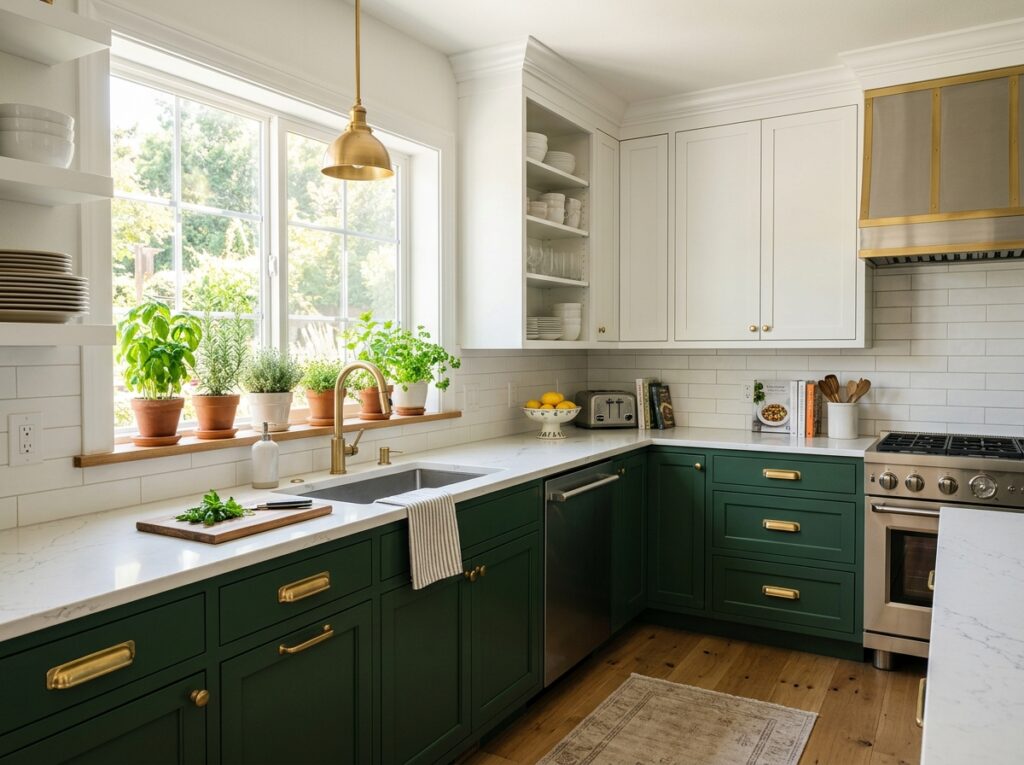
This is a bold, high-contrast look that manages to feel incredibly sophisticated. The lower cabinets are painted a very deep, moody forest green that looks almost black in low light, while the upper cabinets are a bright, clean alabaster white. The stark contrast creates a beautiful horizon line in your kitchen, making the room feel wider and more expansive.
To make this look successful, you need to pull that rich green tone into other parts of the kitchen so it doesn’t feel isolated. You can do this with potted herbs, green glassware on open shelves, or a runner rug with green accents. Use warm, heavy brass hardware to complement the deep green tones, and opt for a clean white quartz countertop to keep the overall look neat and tidy.
- Suggested Price Range: Mid-Range
7. Dusty Blue and Pale Ash Wood
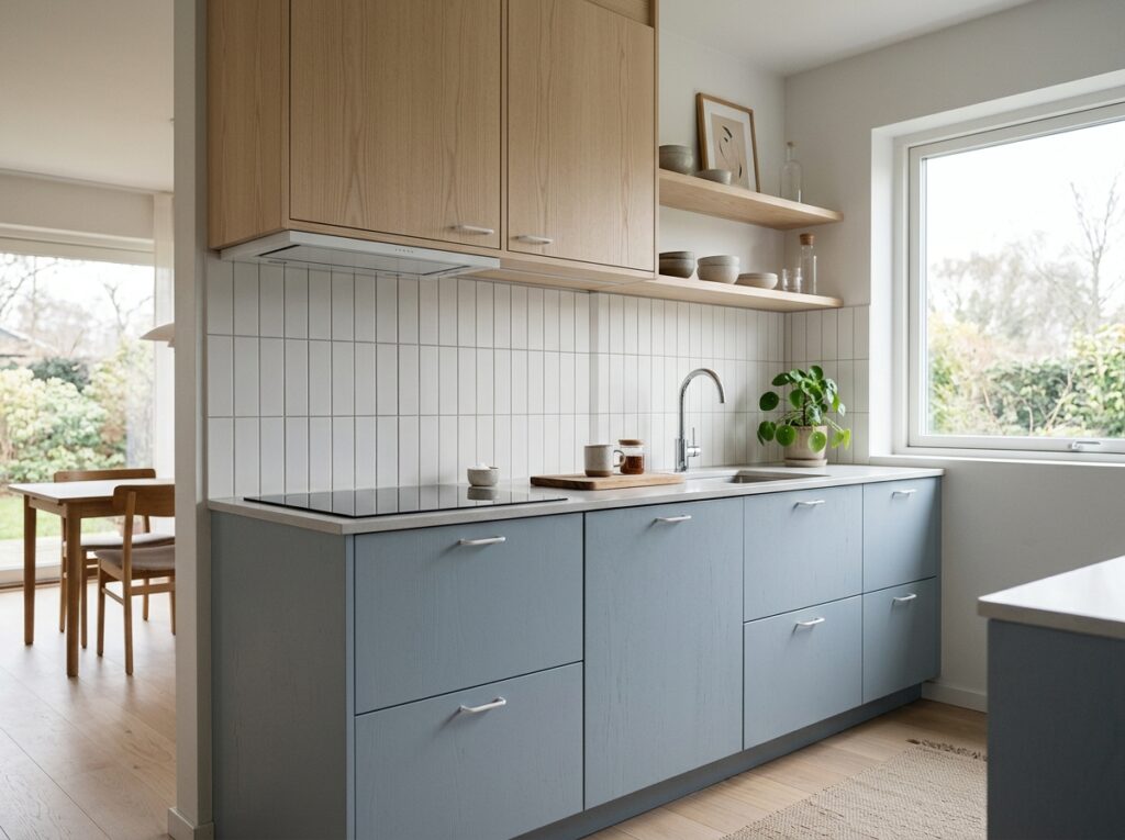
If you love a clean, Scandinavian aesthetic, this light and breezy combination is a perfect choice. The lower cabinets are a very pale, dusty slate blue with cool gray undertones, and the uppers are a light, pale ash or maple wood. It is an incredibly calming palette that works wonders in smaller kitchens where dark colors would feel too heavy or claustrophobic.
I always recommend keeping the hardware incredibly minimal for this look. Sleek, thin cabinet pulls in a brushed nickel or matte white look fantastic. To keep the Scandinavian vibe going, pair these cabinets with a simple white stacked bond tile backsplash and light-colored wood floors. Avoid dark granites or heavy black hardware, which will completely ruin the light, airy mood of the space.
- Suggested Price Range: Mid-range to High-End (depending on the wood species selected)
8. Warm Greige and Dark Espresso Wood
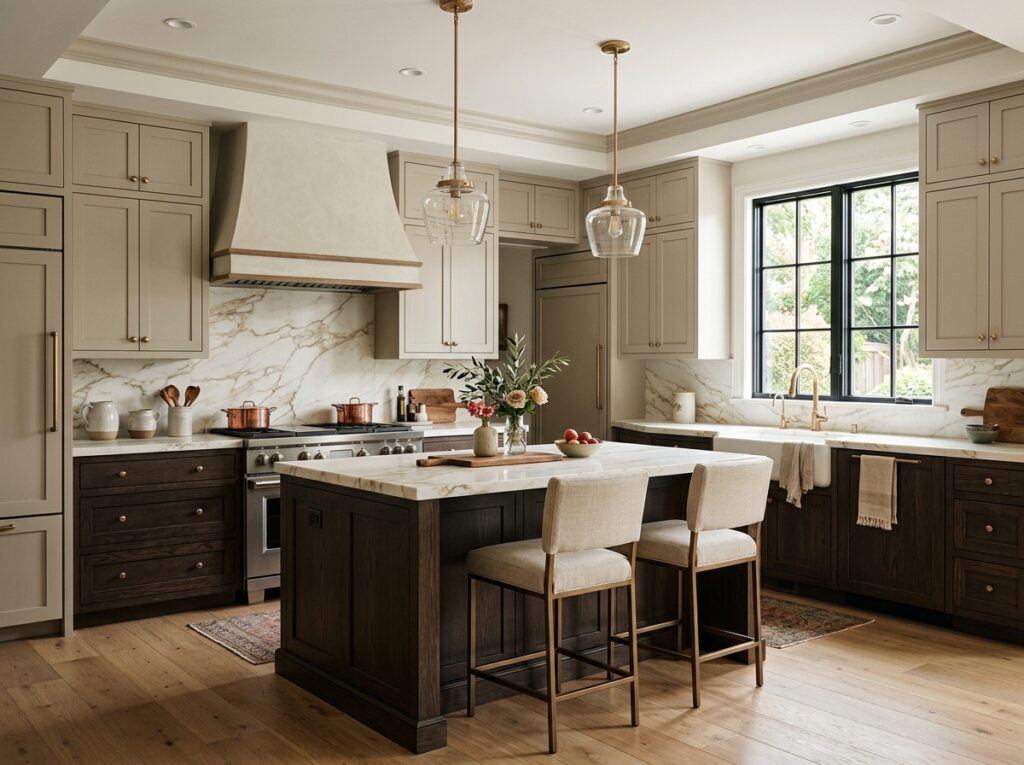
This is a brilliant compromise for anyone torn between a modern painted look and traditional wood stain. The upper cabinets are painted in a soft, warm greige (a beautiful mix of gray and beige), while the lower cabinets or a large central island are made of a rich, dark espresso-stained oak. The warm greige uppers keep the kitchen feeling bright and open, while the dark wood adds a sense of cozy luxury.
To prevent the espresso lowers from looking dated, choose a modern flat-panel or simple shaker door style. Avoid heavy, ornate cabinet profiles. Brushed brass or champagne bronze hardware looks incredibly elegant against both the greige and the dark wood. A simple white marble or quartz countertop with warm gold veining is the ultimate finishing touch for this sophisticated palette.
- Suggested Price Range: Mid-Range
9. Matte Charcoal and Pale White Oak
This look is a beautiful study in modern contrast. The lower cabinets are a deep, smoky charcoal gray, while the uppers are a highly textured, pale white oak. The cool, dark charcoal creates a very modern, grounded base, while the light oak uppers bring in a soft, organic texture that prevents the kitchen from feeling cold or overly industrial.
In my experience, the key to nailing this look is ensuring your white oak has a very matte, non-yellowing finish. Use a clear water-based polyurethane rather than an oil-based one, which can turn yellow over time. Pair this combination with matte black hardware to tie the dark lowers to the light wood uppers, and use a simple, solid white countertop to keep the focus on the beautiful wood grain.
- Suggested Price Range: High-End
10. Mustard Gold and Soft Slate Gray
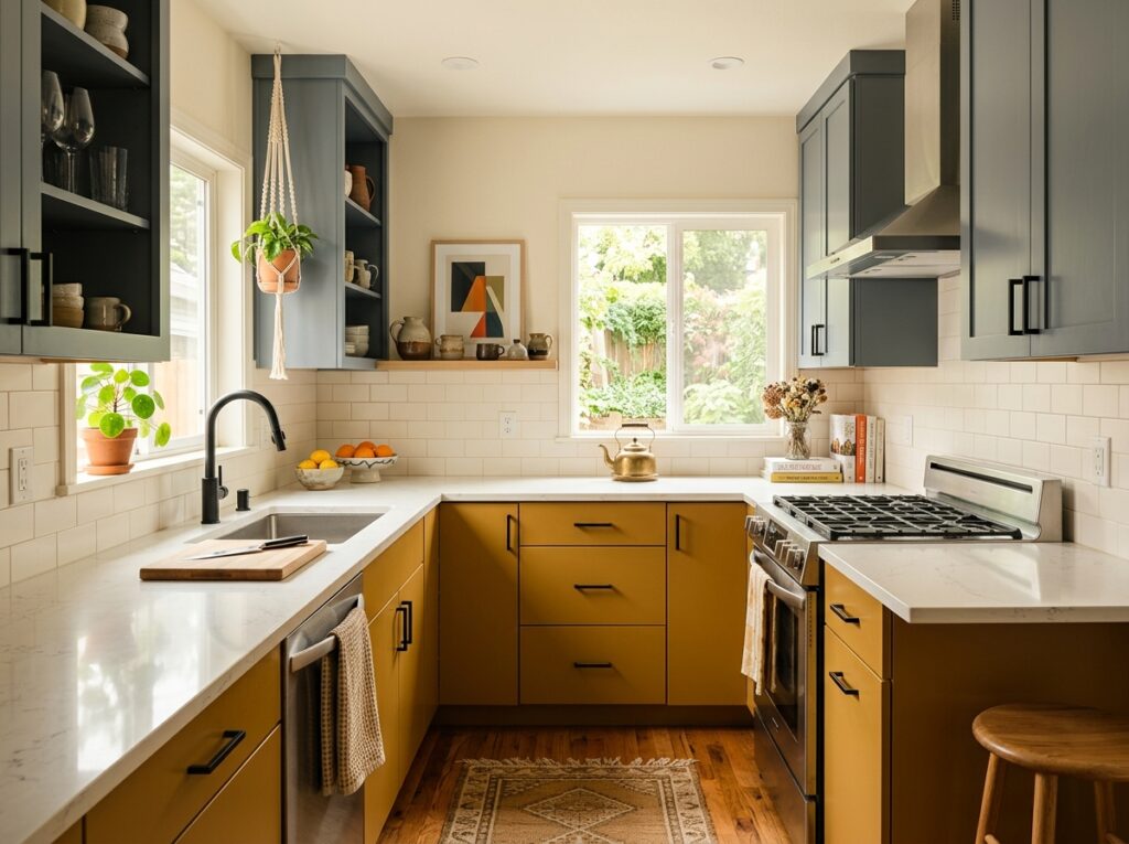
For those who want to bring a bit of cheerful, retro-modern personality into their home, this combination is a joy. The lower cabinets are a warm, earthy mustard gold, while the uppers are a soft, calming slate gray. It is a highly creative palette that feels incredibly custom and intentional, perfect for a home filled with art and mid-century modern furniture.
To keep this looking sophisticated rather than childish, choose a mustard yellow that has heavy brown and ochre undertones rather than a bright primary yellow. The slate gray uppers should have a cool, blue-gray base to balance the warmth of the yellow. Minimalist wood or matte black hardware works best here to keep the focus on the beautiful color block.
- Suggested Price Range: Mid-Range (requires careful color matching, but standard paint lines carry excellent ochre shades)
11. Creamy Beige and Rich Warm Walnut
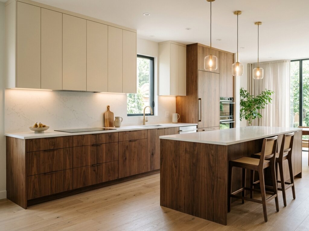
This combination is the epitome of the “quiet luxury” aesthetic. The upper cabinets are a soft, creamy beige that feels much warmer and richer than a standard white, while the lower cabinets are a gorgeous, warm-toned natural walnut. It creates an incredibly peaceful, high-end environment that feels like a boutique hotel kitchen.
To make this look work, keep the countertops as clean and simple as possible. A solid white or very lightly textured cream quartz works beautifully. I highly recommend using integrated finger pulls or very sleek, minimal brass hardware to maintain the clean, uninterrupted lines of the cabinets. Avoid busy backsplashes; a simple sheet of quartz running up the wall looks best.
- Suggested Price Range: High-End
12. Deep Plum Berry and Pale Linen Cream
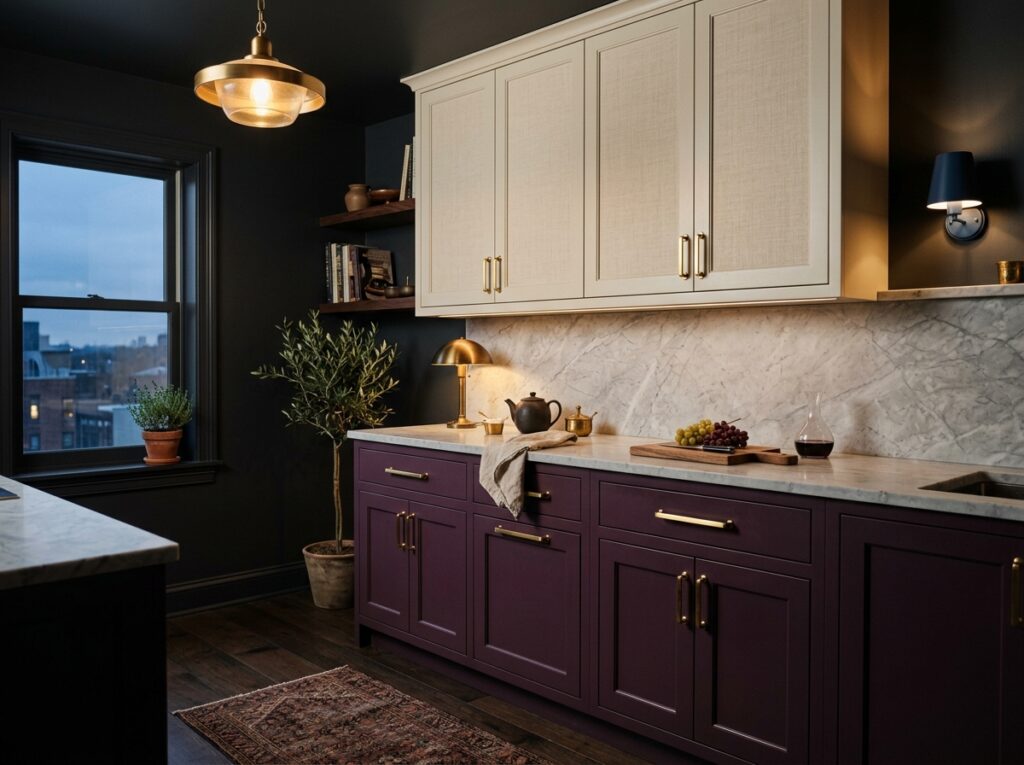
If you want to make a real design statement without your kitchen looking chaotic, this moody combination is stunning. The lower cabinets are a deep, saturated plum or aubergine color, while the uppers are a very pale, textured linen cream. It feels incredibly rich and dramatic, making the kitchen a wonderful place to host evening dinner parties.
The secret to this look is balance. Keep the upper cabinets and walls very light and neutral to allow the deep plum on the lowers to be the star of the show. Pair this with bright brass or copper hardware, which looks magnificent against the purple undertones of the cabinets. For the countertop, a light gray or white stone with minimal movement is ideal.
- Suggested Price Range: Mid to High-End
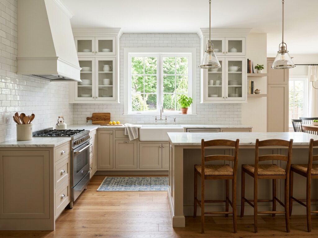
13. Soft Taupe and Chalky White
If you want a look that will absolutely never go out of style, this is the safest and most elegant choice. The lower cabinets are painted a soft, sandy taupe, while the uppers are a classic, chalky white. It is a very gentle, low-contrast look that makes any kitchen feel instantly larger, brighter, and incredibly clean.
Because this palette is so neutral, you need to rely on texture to keep it from looking boring. I always recommend using a textured tile backsplash—like a handmade subway tile—that catches the light unevenly. Pair this with classic polished nickel or chrome hardware for a timeless, sparkling finish that looks incredibly clean and fresh.
- Suggested Price Range: Budget-Friendly to Mid-Range
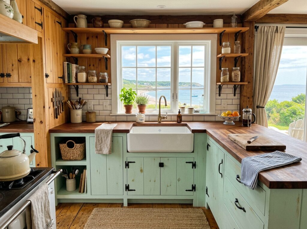
14. Minty Seafoam and Warm Natural Pine
This combination is perfect for a cozy beach cottage or a rustic farmhouse. The lower cabinets are a pale, refreshing mint green with cool undertones, while the uppers are made of a warm, knotty natural pine or light alder wood. It feels incredibly fresh, sunny, and relaxed, instantly bringing a bit of the outdoors inside.
To keep the pine from looking like a 1980s cabin, ensure it is sealed with a modern matte finish rather than a high-gloss orange lacquer. Simple black iron or dark bronze hardware looks incredible against both the mint paint and the natural wood. Pair this with a clean white farmhouse sink and simple butcher block countertops to complete the rustic look.
- Suggested Price Range: Budget-Friendly (especially if utilizing reclaimed pine or simple pine boards)
15. Terracotta Clay and Sandy Beige
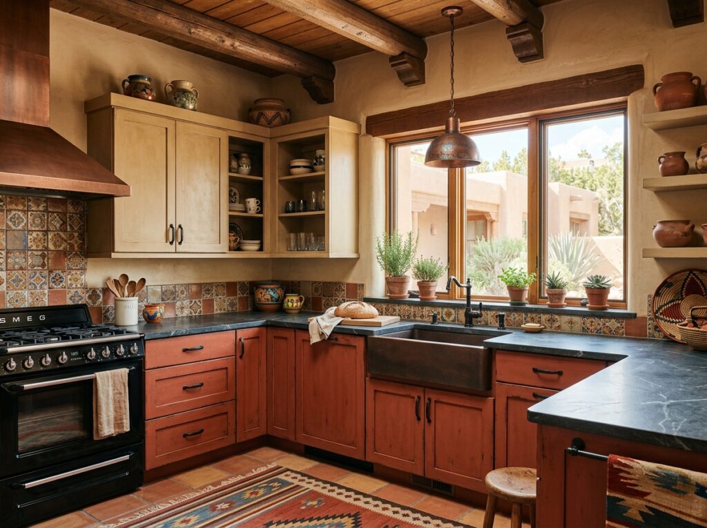
This is a gorgeous, warm palette inspired by southwestern landscapes and Mediterranean kitchens. The lower cabinets are a rich, earthy terracotta red-clay color, while the uppers are a soft, sandy beige. It feels incredibly warm, artistic, and cozy, making the kitchen feel like the true heart of the home.
To keep this looking modern, choose a terracotta paint color with strong brown and pink undertones rather than a bright orange. Matte black or antique brass hardware looks wonderful here. A natural soapstone or dark gray quartz countertop provides a beautiful, cool contrast to the intense warmth of the cabinet colors.
- Suggested Price Range: Mid-Range
16. Deep Teal and Pale Fog Gray
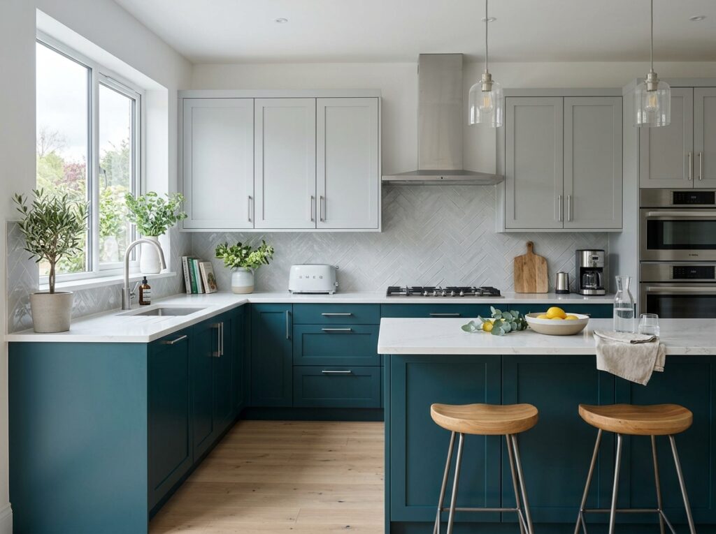
This combination offers a beautiful, cool-toned modern look with a lot of depth. The lower cabinets are a rich, oceanic teal that sits somewhere between green and blue, while the uppers are a very pale, cool fog gray. It is a fantastic option for modern homes with concrete floors or stainless steel appliances, as the cool tones coordinate beautifully.
To make this look cohesive, pair it with modern chrome or brushed steel hardware. A solid white quartz countertop keeps the look clean and sharp. If you want to add a bit of warmth, you can do so through accessories, like a warm wood cutting board sitting on the counter or a brass kettle on the stove.
- Suggested Price Range: Mid-Range
17. Dove Gray and Bright Alabaster White
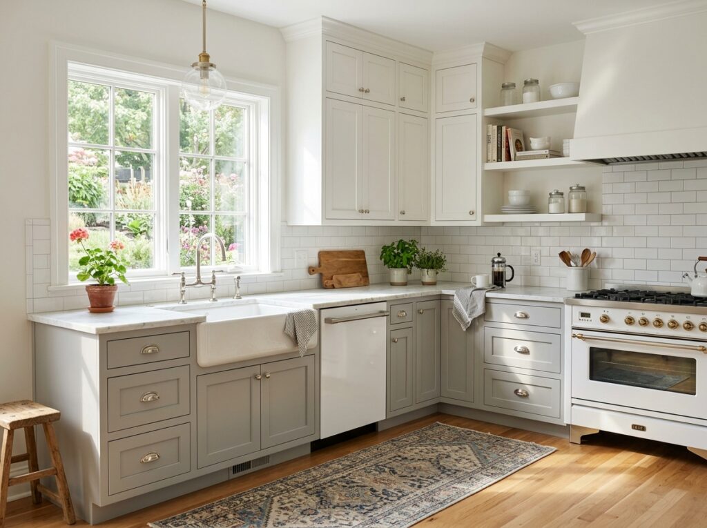
For a clean, bright, and classic look that feels slightly more modern than a plain white kitchen, this pairing is incredibly popular. The lower cabinets are a soft, gentle dove gray, and the uppers are a bright, clean alabaster white. It offers a very subtle, low-contrast transition that makes the kitchen feel open and incredibly neat.
In my experience, this look works best when you keep things classic. Pair these cabinets with polished nickel cup pulls and traditional shaker doors. A classic white Carrara marble or marble-look quartz countertop is the perfect match. To prevent the space from looking too sterile, add a warm wood runner rug on the floor or hang some copper pots on a rack.
- Suggested Price Range: Budget to Mid-Range
18. Matte Navy and Bleached White Oak
This is a modern, high-end twist on the classic coastal look. The lower cabinets are a flat, matte navy, while the uppers are a stunning, bleached white oak with a very light, almost white-washed finish. It feels incredibly fresh, modern, and expensive, perfect for a contemporary home with high ceilings and lots of windows.
To make this look work, ensure the bleached oak has a very dry, matte look with no yellow tones. Sleek, minimal brass hardware looks incredible against both the navy and the light wood. Use a clean white quartz countertop with very subtle gold or gray veining to tie the two elements together perfectly.
- Suggested Price Range: High-End
19. Pewter Gray and Natural Maple Wood
This combination is a beautiful option for a modern, slightly industrial kitchen. The lower cabinets are a mid-tone pewter gray with cool undertones, while the uppers are a light, warm natural maple. The maple wood adds a lovely, soft warmth that balances the cool, industrial feel of the gray paint.
I love pairing this look with matte black hardware, which stands out beautifully against the light maple wood. A gray concrete-look countertop looks incredible here, adding to the modern, industrial aesthetic without making the kitchen feel cold. Keep the backsplash simple with white or light gray tiles.
- Suggested Price Range: Mid-Range
20. Chocolate Brown and Warm Creamy Ivory
Rich, warm browns are making a massive comeback in home design, and this combination shows exactly why. The lower cabinets are a deep, rich chocolate brown paint or a dark walnut stain, while the uppers are a soft, warm ivory. It feels incredibly cozy, comforting, and rich, like a warm cup of coffee on a cold winter afternoon.
To keep this looking modern and fresh, choose an ivory paint for the uppers that has warm, yellow-creamy undertones rather than cool gray ones. Warm brass or bronze hardware looks beautiful here. Pair this with a warm cream or beige countertop to keep the palette soft, harmonious, and incredibly inviting.
- Suggested Price Range: Mid to High-End
21. Eucalyptus Green and Light Birch
This combination is incredibly peaceful, light, and natural. The lower cabinets are painted a soft, silvery eucalyptus green, while the uppers are a pale, clean birch wood. It feels very clean, modern, and spa-like, making it a wonderful choice for homes that focus on natural materials and minimalist living.
Keep the hardware very minimal and clean—brushed nickel or slim white metal pulls work beautifully. A simple white stacked tile backsplash and white quartz countertops will keep the kitchen looking bright and fresh. Add a few green plants on open shelving to pull the natural eucalyptus tone up into the top half of the room.
- Suggested Price Range: Mid-Range
22. Midnight Blue and Honey Oak
If you want a look that feels stately, traditional, and incredibly solid, this is a gorgeous pairing. The lower cabinets are a very deep, almost-black midnight blue, while the uppers are a warm, glowing honey oak. It is a beautiful way to update a traditional home without losing its historic charm and warmth.
To keep this looking fresh, choose a modern, slim shaker profile for the cabinets rather than heavily detailed traditional doors. Brass or antique bronze hardware looks magnificent against both the deep blue and the warm wood. Pair this with a clean white countertop to keep the middle of the kitchen looking bright and updated.
- Suggested Price Range: Mid to High-End
23. Soft Lavender and Deep Charcoal
For those who want a truly unique, artistic kitchen that feels incredibly custom, this unexpected combination is stunning. The lower cabinets are a very deep, grounding charcoal gray, while the upper cabinets are a soft, dusty lavender with heavy gray undertones. It feels incredibly soft, creative, and modern, perfect for a creative homeowner.
To make this look successful, the lavender must be very dusty and muted—almost like a gray with purple undertones—rather than a bright pastel lavender. Sleek matte black hardware looks incredible against the soft purple and charcoal, keeping the overall look sophisticated and modern. Pair with a clean, solid white quartz countertop.
- Suggested Price Range: Mid-Range (requires custom paint tinting, but results in a highly unique look)
24. Sandstone Beige and Dark Slate Gray
This is a beautiful, high-contrast look that feels incredibly grounded and natural. The lower cabinets are a deep, textured slate gray, while the uppers are a warm, sandy beige. It feels like a modern desert home, balancing cool and warm natural tones in a way that is incredibly easy to live with day-to-day.
To style this, use hardware in a modern matte black or a dark oil-rubbed bronze. A textured backsplash, like a limestone tile or a rough plaster finish, looks incredible with this natural palette. Choose a light-colored countertop with subtle warm veining to bring the sandy beige and slate gray together beautifully.
- Suggested Price Range: Mid-Range
25. Pale Dusty Pink and Dark Charcoal
This is an incredibly chic, modern contrast that feels playful yet highly sophisticated. The lower cabinets are a deep, moody charcoal gray, while the uppers are a very pale, dusty pink with heavy gray undertones. The dark charcoal lowers keep the kitchen looking grounded and modern, preventing the pink uppers from looking sweet or childish.
To make this look work, the pink must be incredibly subtle—think of a warm neutral with a tiny hint of blush, rather than a true pink. Matte black or sleek brass hardware looks incredible here, adding a sharp, modern edge to the soft pink uppers. Pair with a solid white or light gray countertop to keep the look clean and balanced.
- Suggested Price Range: Mid to High-End
How to Get Your Two-Tone Kitchen Right
In my experience, the biggest mistake people make when planning a two-tone kitchen is not creating a clear “line of sight.” If you have cabinets that go all the way to the ceiling, make sure the color change happens consistently at the countertop line. Don’t mix and match random cabinet doors; keep the uppers one color and the lowers another, or keep the perimeter cabinets one color and make your kitchen island a contrasting statement shade.
Another detail that is easily overlooked is the backsplash. Your backsplash is the bridge that connects your two different cabinet colors. I always recommend choosing a backsplash that is light and neutral, but contains tiny hints of both colors, or simply matching the backsplash directly to your upper cabinet color to keep the top half of the kitchen feeling as open and bright as possible.
Frequently Asked Questions
Which color should go on top in a two-tone kitchen?
In almost every situation, the lighter color should go on the upper cabinets and the darker color should go on the lowers. This keeps the heaviest visual weight at the bottom of the room, which naturally makes your ceilings feel higher and your kitchen feel much brighter and more open.
Do two-tone kitchen cabinets make a kitchen look smaller?
Not if they are styled correctly! Putting the lighter shade on the upper cabinets actually helps make a small kitchen feel larger because it bounces light around at eye level, while the darker lowers add depth and grounding interest without crowding your field of vision.
What kind of hardware works best for two-tone cabinets?
I usually recommend choosing one consistent hardware finish (like brass, matte black, or polished nickel) for the entire kitchen to tie the two different cabinet colors together. If you want to mix hardware, use cup pulls on the lowers and simple matching knobs on the uppers in the exact same metal finish.
How do I choose a countertop that matches both cabinet colors?
Look for a countertop with a light, neutral base color (like white or light gray) that features subtle veining or flecks that mirror the colors of your cabinets. For example, a white quartz with warm gold and cool gray veining works perfectly to bridge a warm oak and black cabinet combination.
Is the two-tone kitchen cabinet trend going out of style?
Not at all. While specific color trends change over time, the fundamental design concept of splitting your cabinet colors is a classic technique used to balance light and weight in a room. Choosing classic color pairings like navy and white or oak and cream ensures your kitchen will look stylish for decades to come.
Wrapping Up
At the end of the day, your kitchen should feel like a place where you actually want to spend your time, cook meals, and gather with family. You do not need to spend tens of thousands of dollars on custom designer cabinetry to get a beautiful, high-end look; often, a couple of cans of high-quality cabinet paint and some updated hardware are all it takes to completely revive your space.
If you are feeling overwhelmed, I highly recommend picking just one or two of your favorite combinations from this list, getting a few paint samples, and painting them on large pieces of cardboard. Tape them to your cabinets and watch how the light hits them throughout the day.
Which of these two-tone cabinet combinations would you actually want to put in your own home first? I would genuinely love to know—let me know in the comments below!